
Our organization identified a pressing need for a scalable and customizable design system, dubbed Peak Opus, to address the challenges faced by our clients in branding and product development. With increasing demand for white-label solutions across industries, existing design systems often lacked flexibility and adaptability, hindering client satisfaction and efficient project delivery. The absence of a comprehensive, white label-able design system posed a significant obstacle in meeting diverse client requirements and maintaining brand consistency across multiple platforms and products.
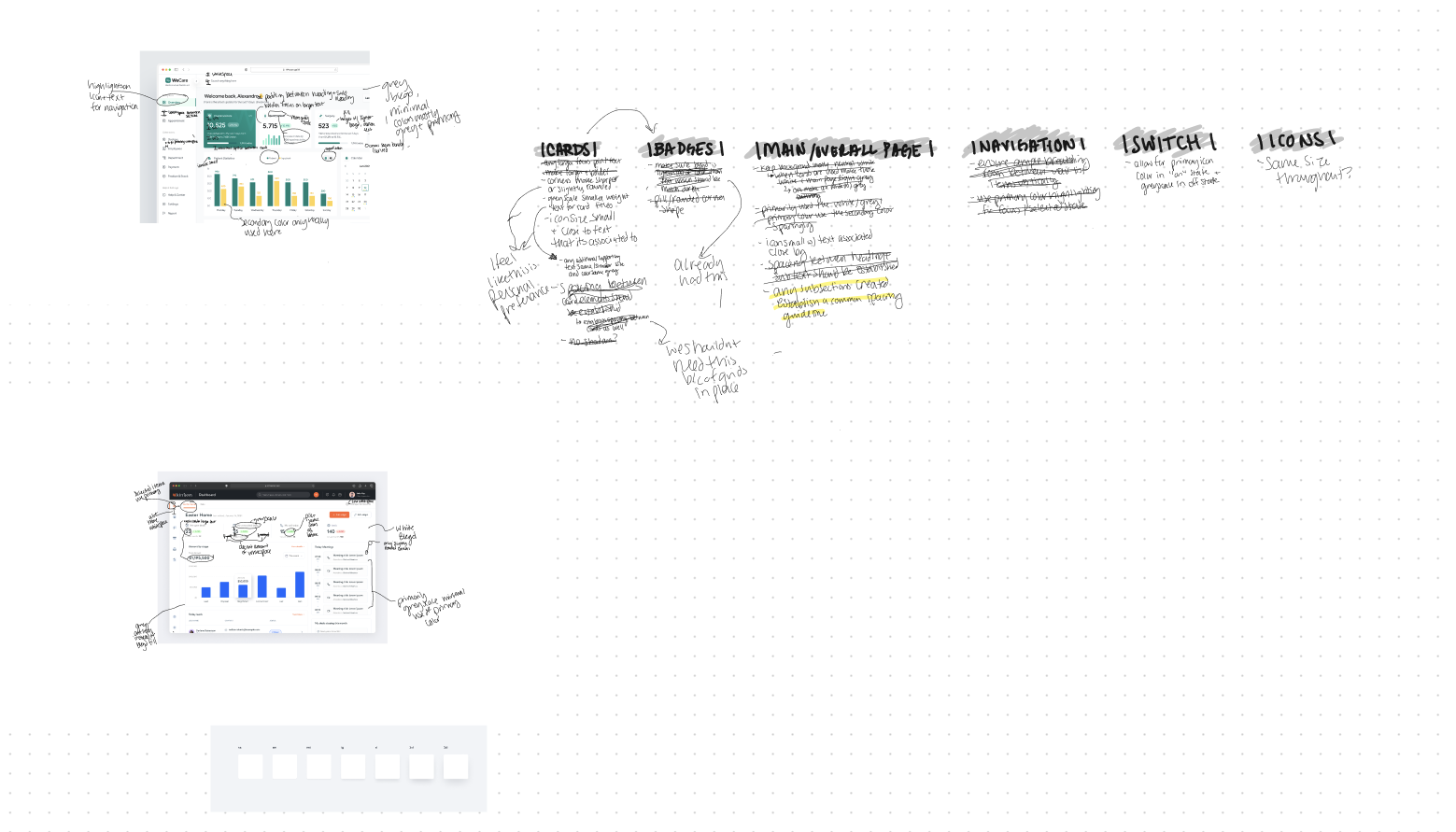
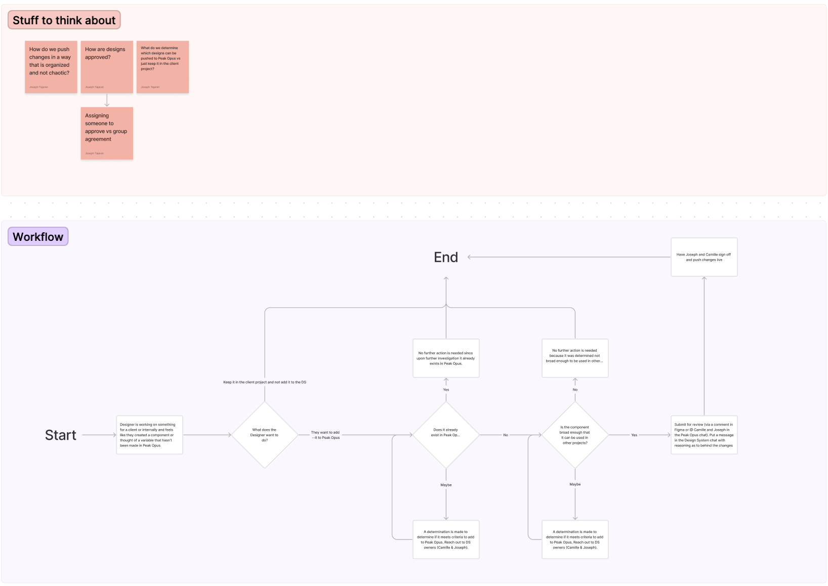
Through iterative design and feedback loops, we refined the components and documentation of our new system. Continuous collaboration among cross-functional teams ensured alignment and consistency. Rigorous testing and validation were conducted to ensure usability and accessibility standards were met.
See how others are formatting design system standards and find our version of it
Ensure the verbiage is streamlined for developer use cases
Create components that are web ready (and in future use cases ensure for mobile as well)
Create components we utilize on most projects to ensure they'll be used in the future
Once we'd gathered some good research from others, our own experience, and our teams expectations, we went through feedback sessions with our team to ensure nothing was missing. This ensured that once the system would be rolled out, others would have knowledge and capabilities to continue using it on their own.
Whenever possible, it is always nice to have some slight shortcuts in place to get processes a little quicker or at least at a starting point. Utilizing some of the Figma plugin's below we were able to accomplish some things at least as a starting point.
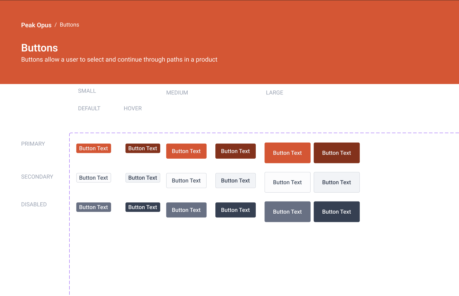
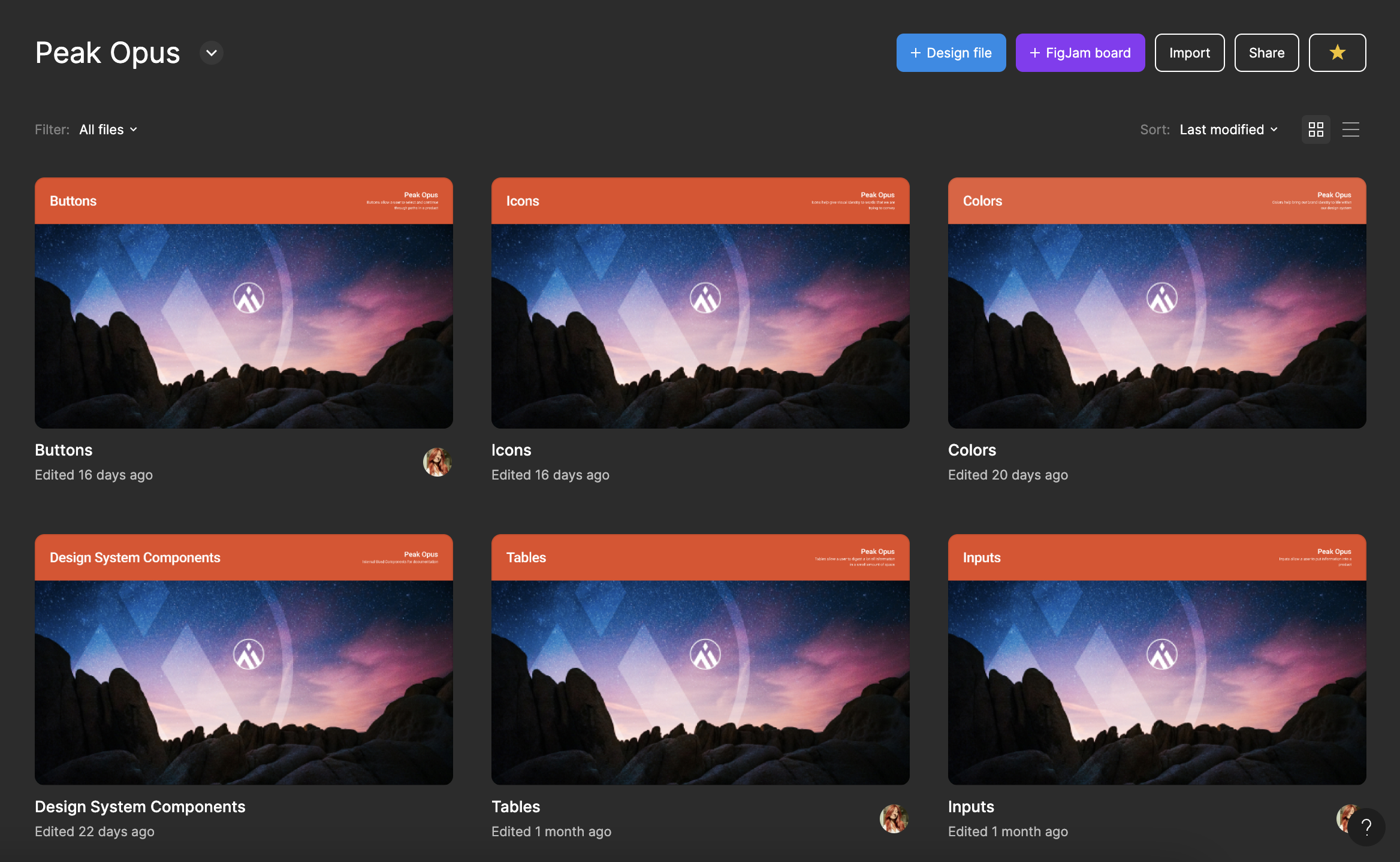
Through collaborative brainstorming sessions and iterative prototyping, we refined these patterns into reusable components. The components we ended up creating and refining were: Buttons, Tables, Inputs, Containers, Navigation, Tabs, Badges, Cards, Alerts, Side Scroll Bar, Radio Checkboxes to name a few.
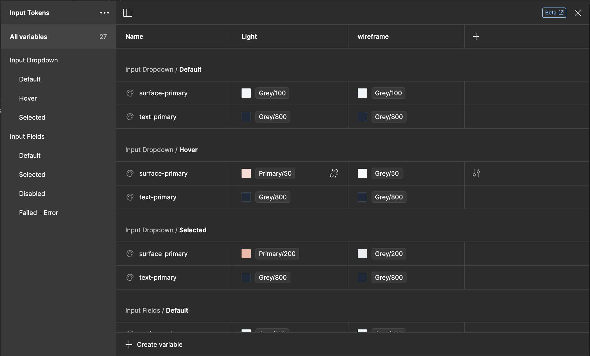
As well as utilizing Figma variable system, typography, and spacing and radius values to conform to a consistent system.


My passion for creating design systems in UX, nurtured by my time at Cars.com and from learning at Figma Config, arises from the structured solution they offer to the complexities of managing diverse user interfaces. Through them, I've delved deep into understanding user needs and behaviors, fostering empathy and awareness. I find excitement in the balance they offer between consistency and creativity, empowering me to innovate while maintaining coherence. Moreover, the collaborative nature of developing these systems aligns with my preference for team environments, where shared ownership and camaraderie thrive, ultimately driving impactful solutions.
Although this design system is currently decently built out as well, my hope and goal with all systems is that they're living documents continually growing and changing per needs of the users.