At a construction company, they sought to modernize its project bidding products to enhance usability, speed, and efficiency. The objective was to elevate the existing product to meet contemporary UX standards while integrating additional functionality for improved usability in the future.

First we did assessments of their current product. Making flow diagrams, personas, and journey maps. We created these by walking through the product ourselves, and utilizing a few user interviews to get a sense of what our users do day to day within the platform. After that we set up any calls for clarifying anything in the users flow to which did not make sense to us or if they needed to be adjusted to make sure we got the picture.
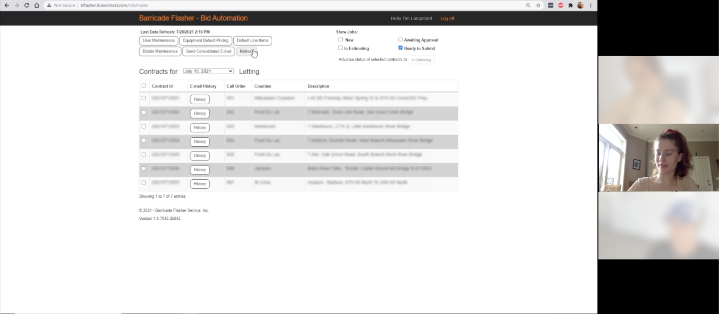
Prepare and understand how users typically work now, and hear them out on issues they're facing

Empathize and digest information taken from user interviews

Helped us see and understand areas we could improve within their current product and find ways to improve processes
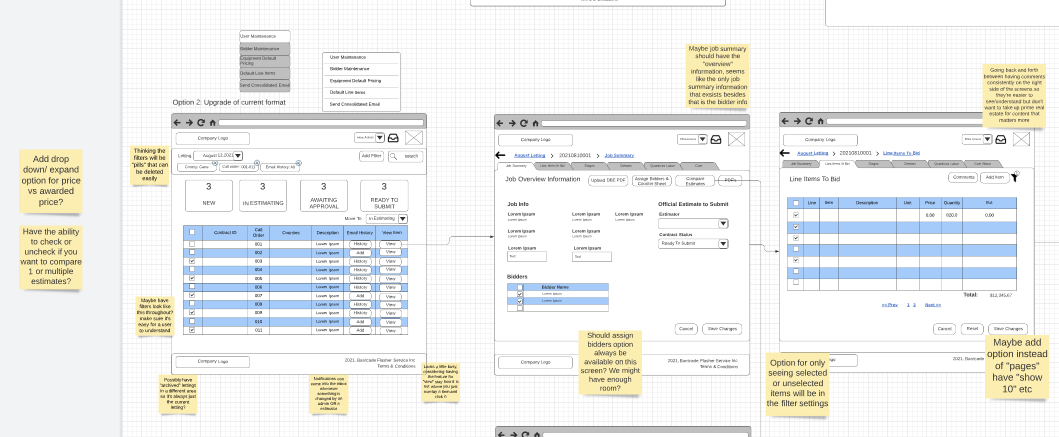
Iterating through some initial ideas helped us quickly understand what would and wouldn't work for the team that would be utilizing the product. This helped us gather valuable feedback from real users, and our internal team. We spoke to our stakeholders, developers, and our internal UX teammates (myself and one other designer) to make sure that we were keeping our users in mind the entire way.

Utilizing the Material Design library, we were able to get things up and running in a quick manner, we also added customized and more adjusted components as needed for the needs of the product.
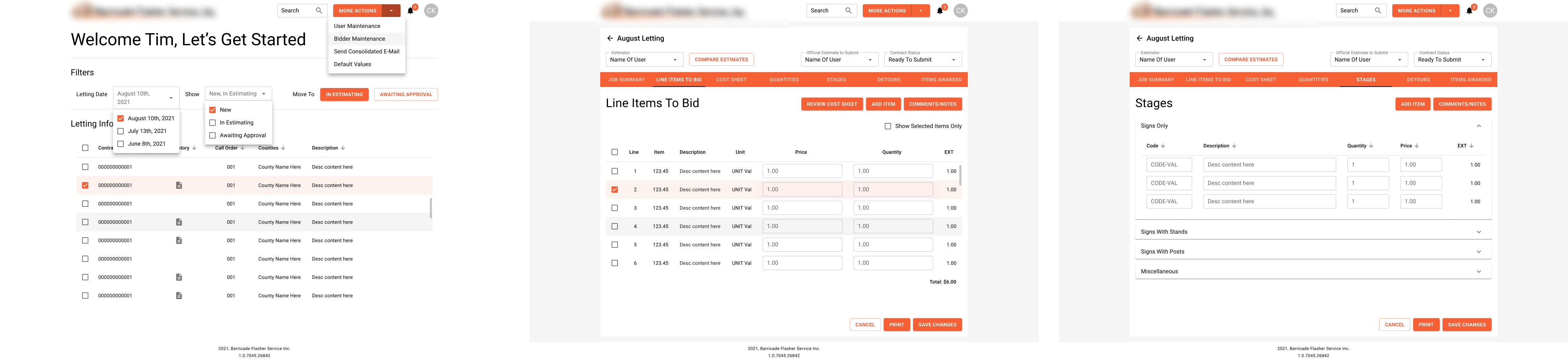
After iterating through some initial ideas with our key stakeholders from the client side, we created high fidelity designs utilizing the Material design component library. Utilizing the component library allowed us to quickly move and adjust things as the clients feedback came in.
I felt great pride within this project, working with a associate designer, as well as so many knowledgeable individuals throughout the process. Utilizing a pre-built design system also ensured that we were able to meet product deadlines and deadlines for the clients interaction itself, but that goes without saying that some adjustments were made as well for their products needs.
If I could go back and change anything I would really like to do a follow up user testing of the new product, and see if there's anything that we implemented that could be better improved. I would also suggest some improvements to the design system allowing for less of the screen to appear as so orange focused, and doing further renditions of the patterns created for more cohesion.